
Vancouver Italian Festival
Vancouver's Italian Festival celebrates the city's finest Italian food and music, focusing on culture. Held during June, it brings in about 300,000 attendees and spans 14 blocks. The event honours the history and contributions of Italian immigrants who came to Vancouver with nothing but a suitcase to improve their family’s lives.
This rebrand aimed to reintroduce the energy and charisma that the festival had pre-pandemic. I wanted to tap into the full-bodied personalities, flavourful cuisine, and artistry that make up Italian culture. I did so by using traditional and non-traditional colours in their updated palette, utilizing characters in their marketing materials, and being more playful overall.

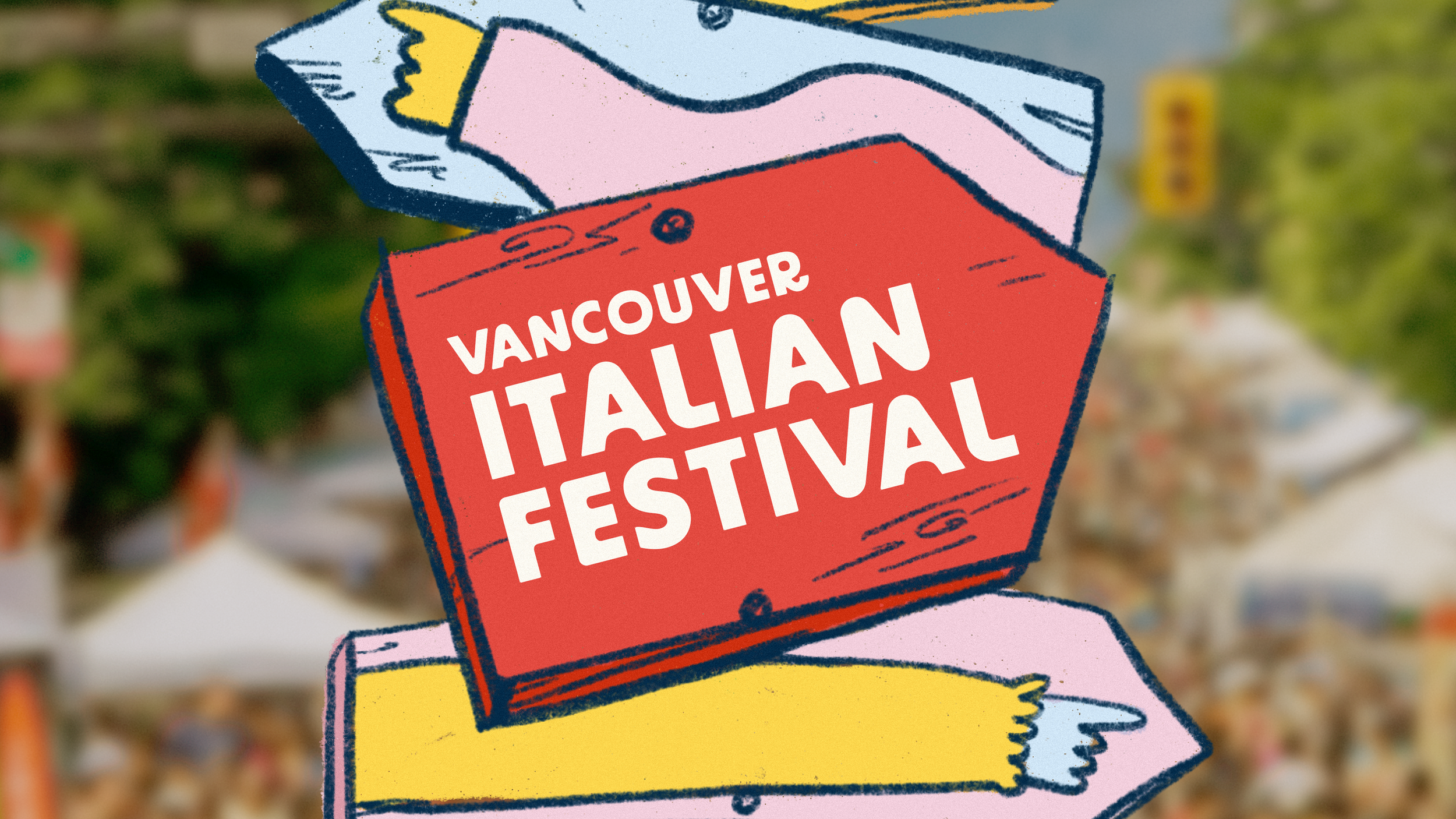
I stuck with something playful and fun yet clean for the Primary Logo. I wanted it to be easily legible but not so simple that it was boring since I wanted to maintain the event's dynamic culture. I used BD Super as the logotype as it has a whimsical feeling. However, it was a bit too stiff for my liking, so I modified it to look more "noodly" and better fit the supporting elements in the branding. For the secondary logo, I took inspiration from the triangle flags that decorate the streets during the festival. The final logos are minimal enough that the festival could use them well into the future.
event POSTERS
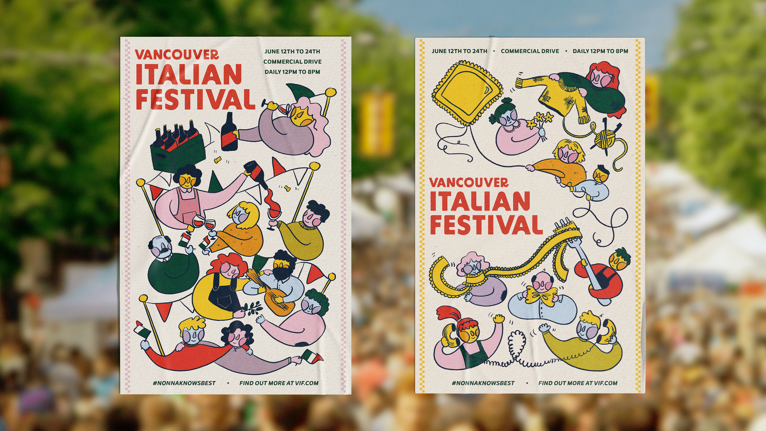
I know you're not supposed to play with your food, but I did say we were going for playful. Given all the unique pasta shapes Italians have come up with, I wanted to incorporate them into the marketing materials. I wanted the posters to emphasize the community and the culture behind the festival, and what is more Italian than eating with friends?

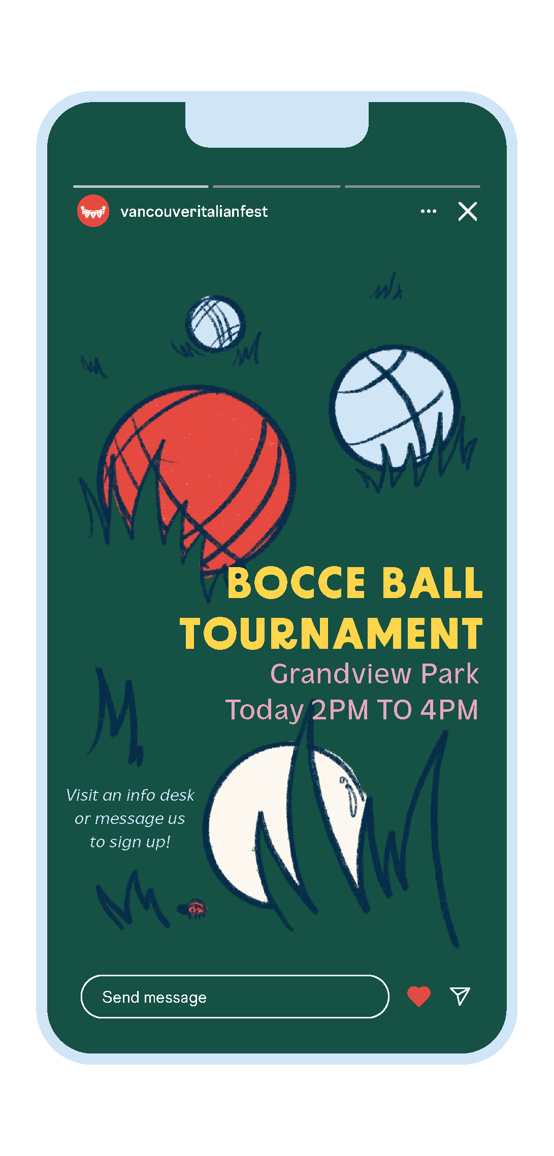
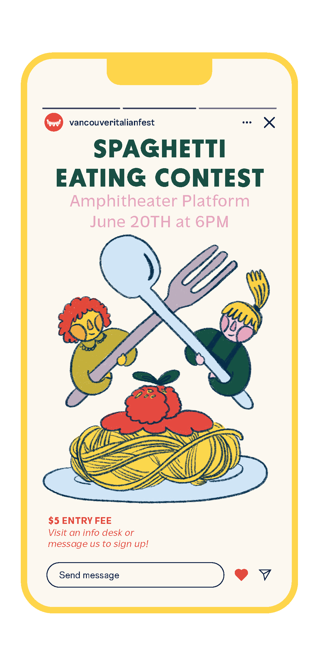
Social Media
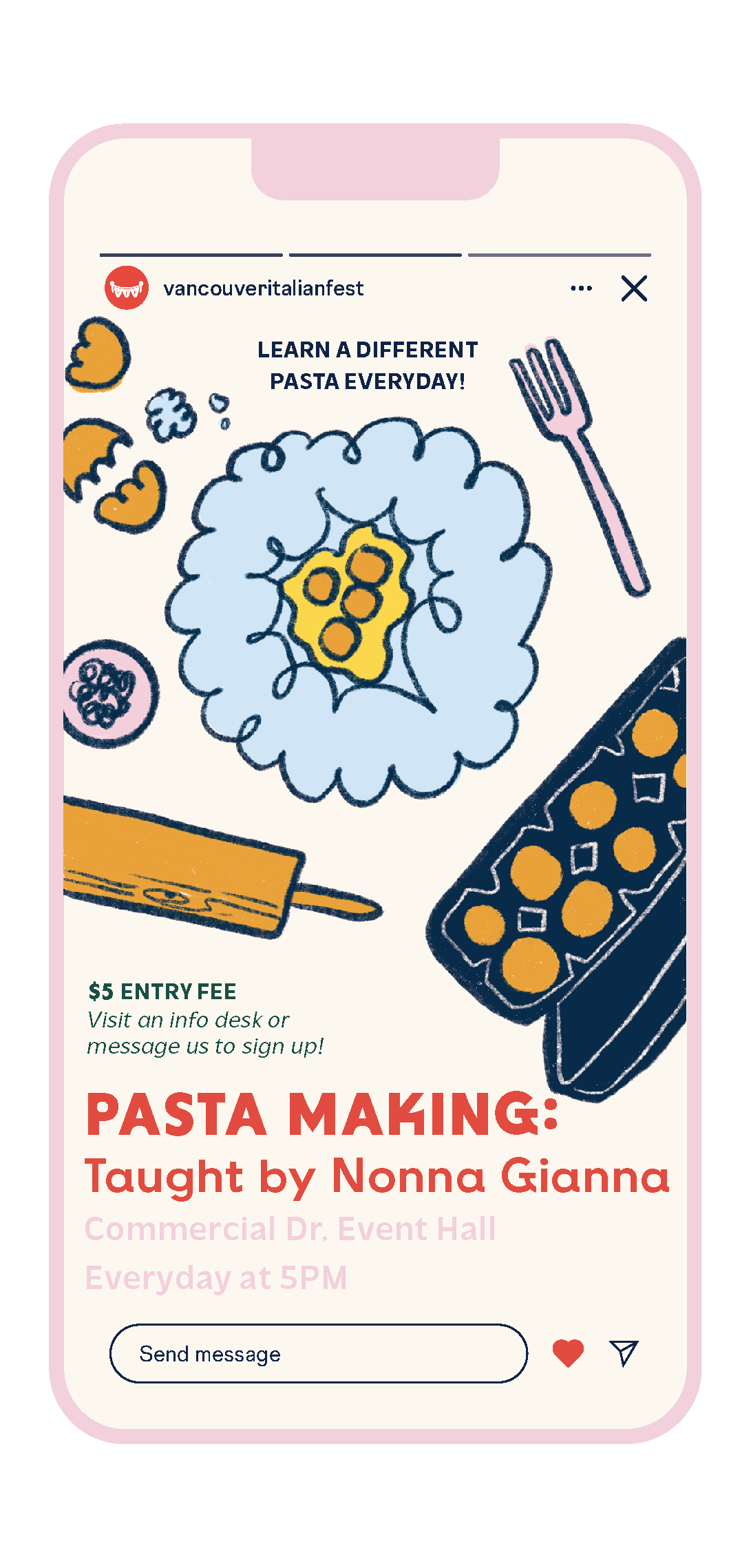
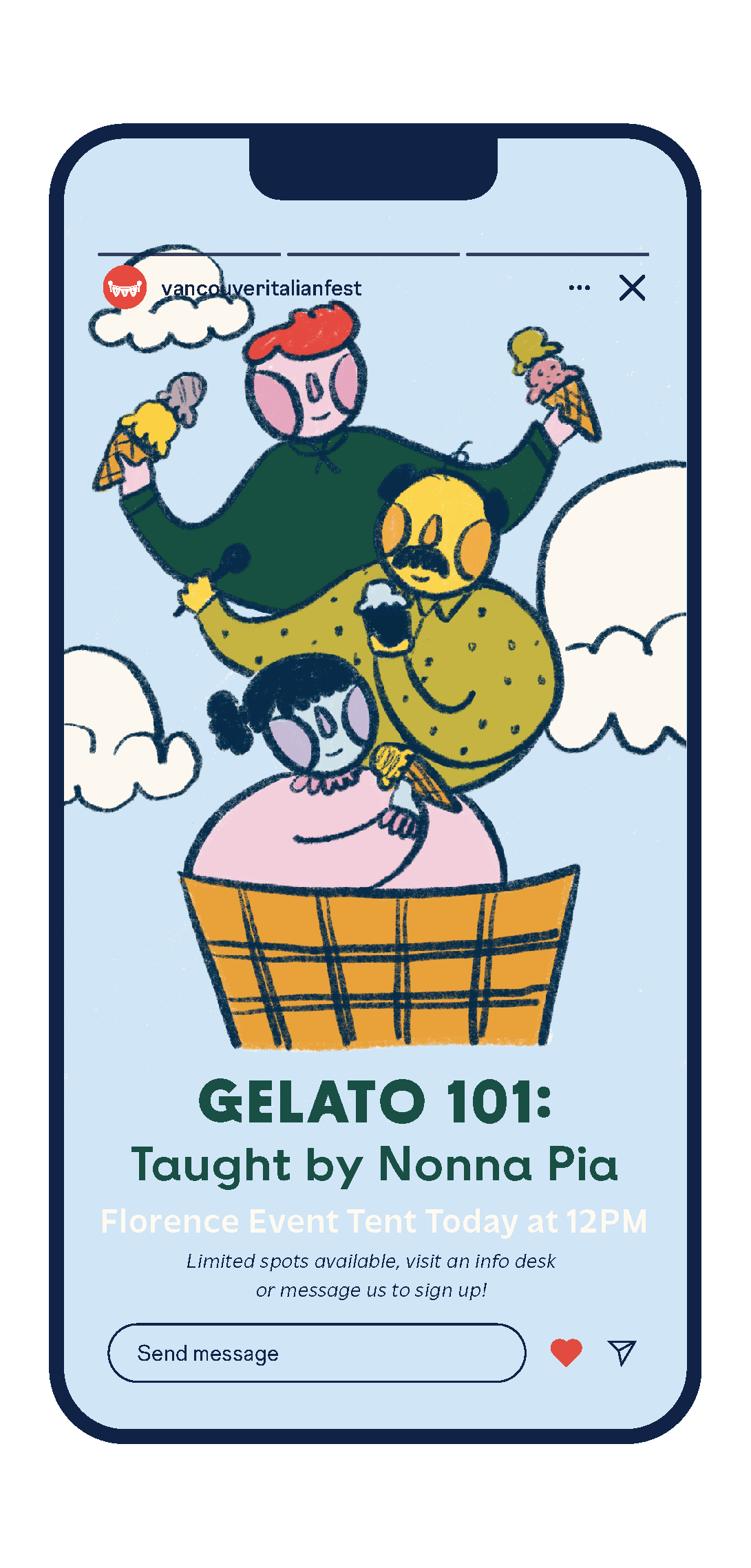
Our attendees' engagement before the festival was crucial in building an atmosphere of excitement going into the festival. Social media played a large part in achieving this; with the hashtag #nonnaknowsbest we were able to engage the community through Q&A's, feature real Nonnas who told their stories and exchanged recipes, and tease events within the festival. The hashtag also allowed attendees to share their stories, which we could then feature on our socials. This exchange created its own "Little Italy" online, allowing people to connect within the Italian-Canadian community.

event signs
For the event signs, I wanted them to be rustic and playful. I chose to reiterate elements from the character illustrations by painting them onto these rough wooden signs. Not only do they look cohesive with the rest of the branding, but they are functional for years to come. They can easily be repainted and positioned according to that year's layout.
Want to see more?
Click on one of the project names below.