I use These Bite-Sized projects to test out new styles and keep my key commands fresh.
You can find more small projects like these on my Instagram.
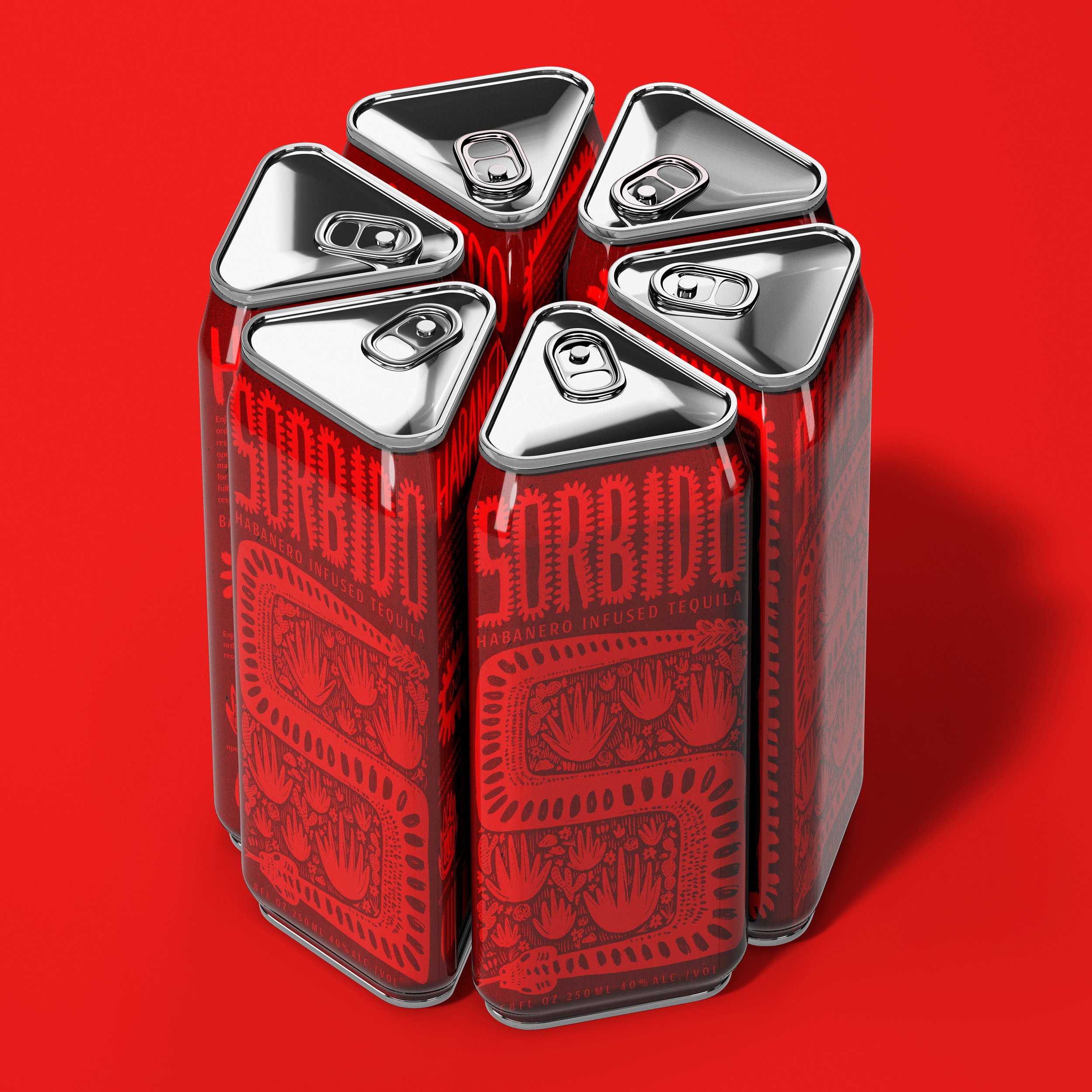
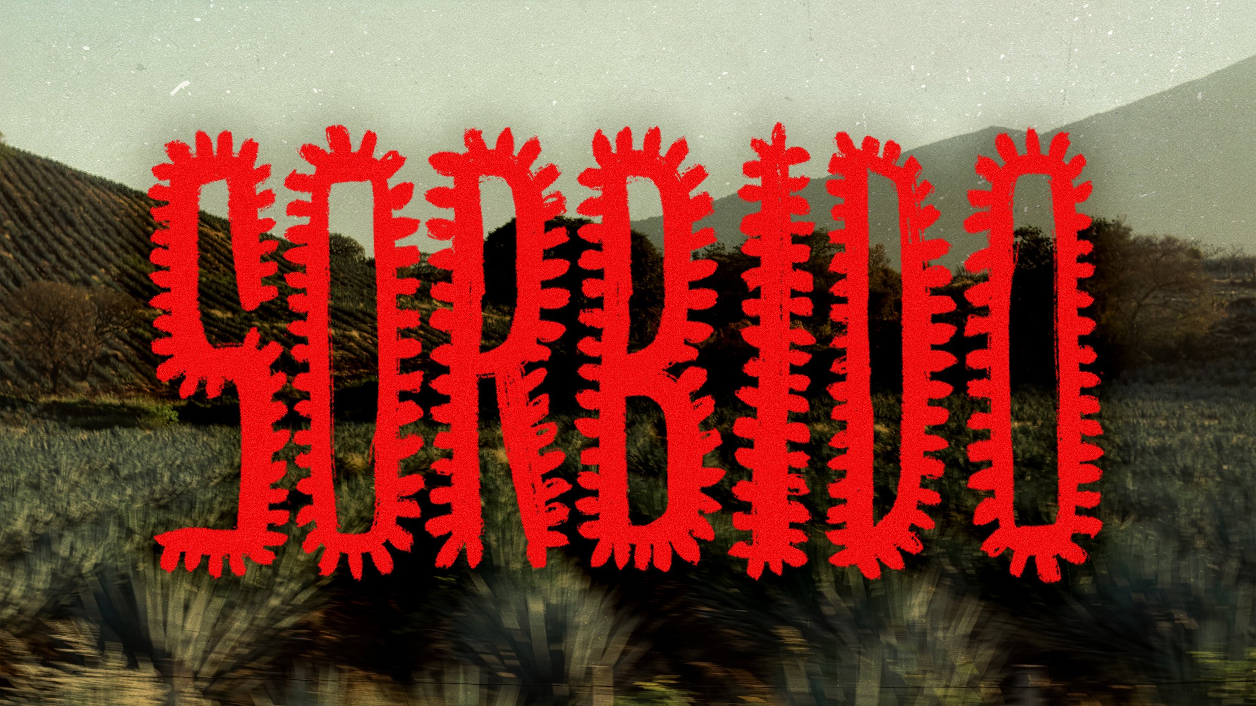
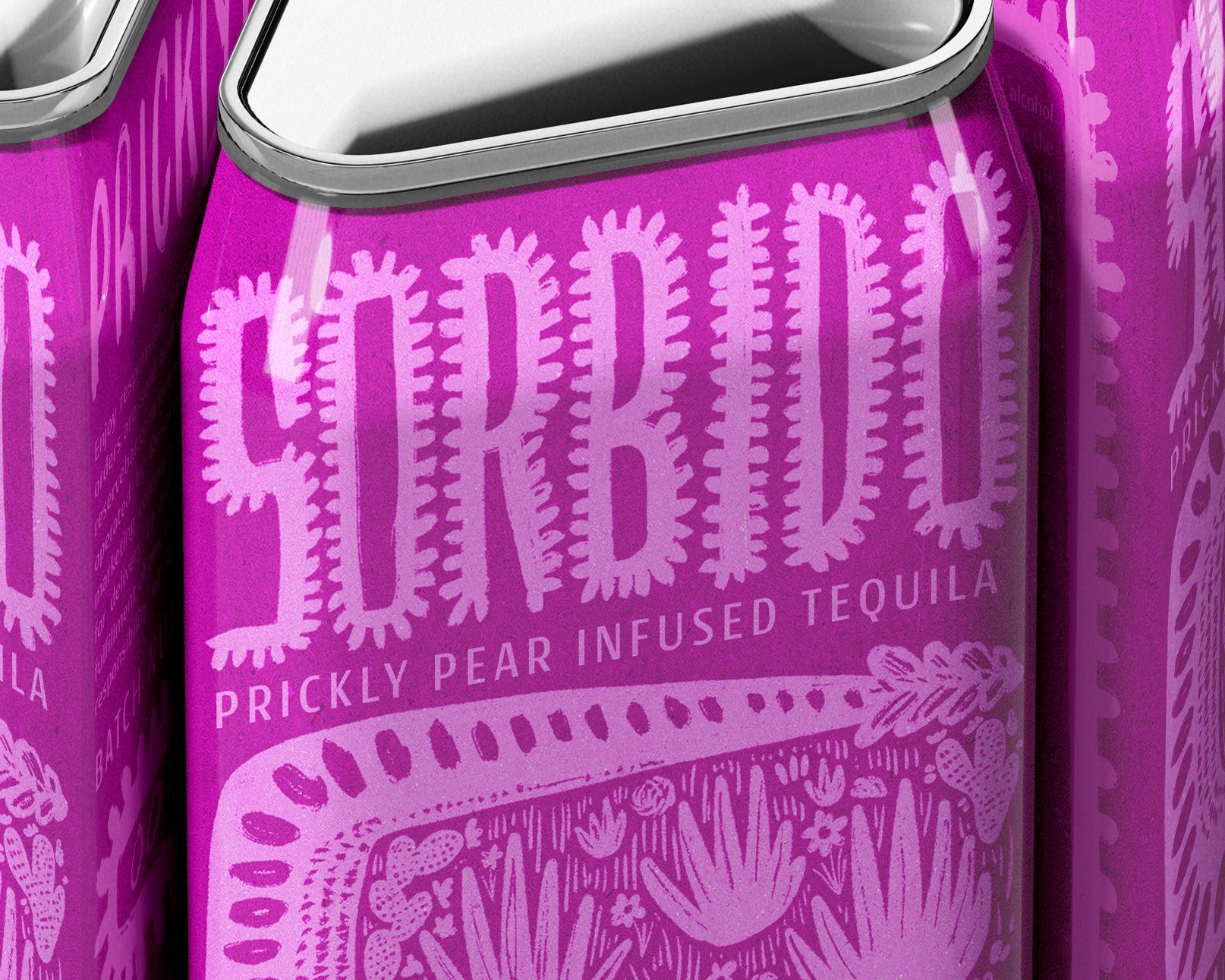
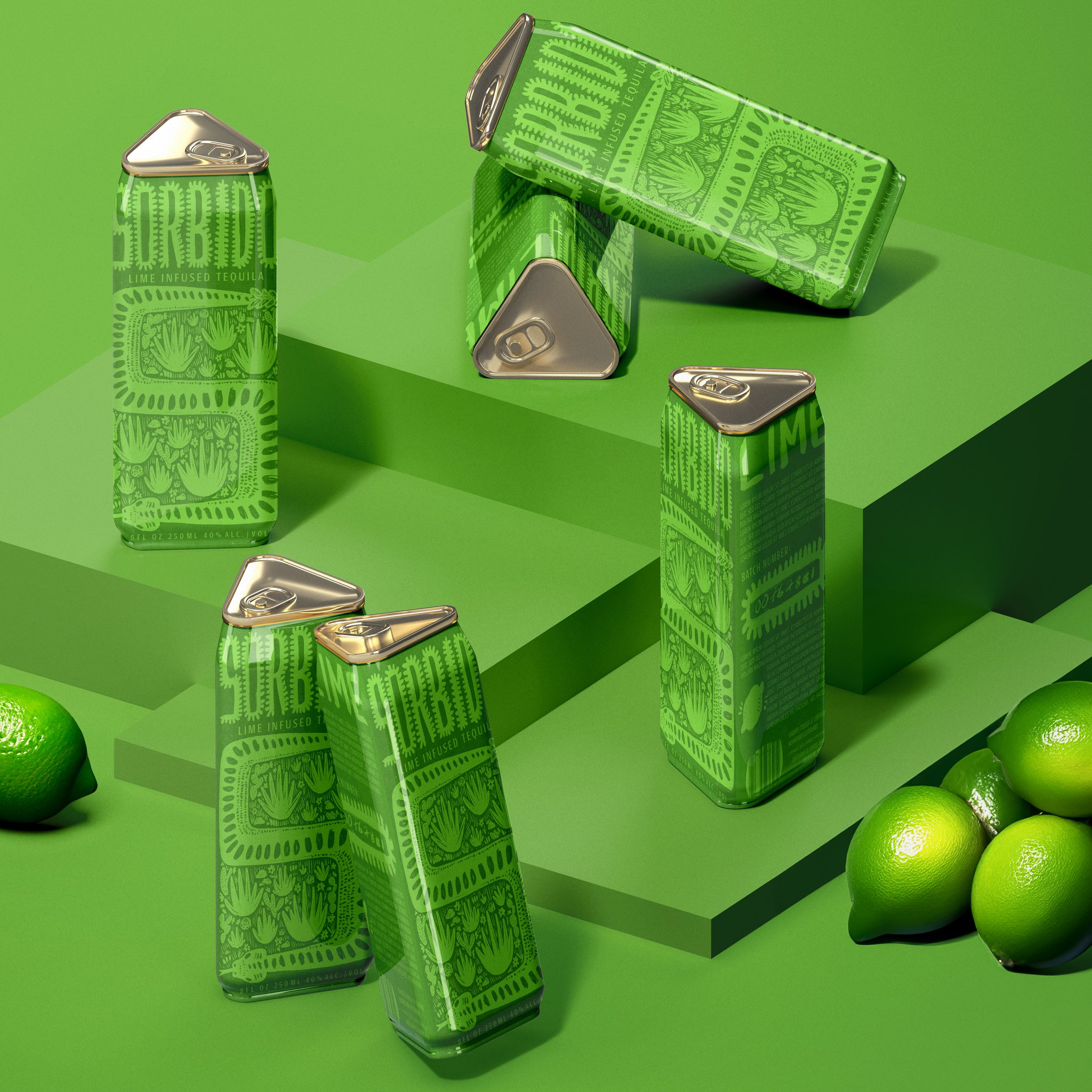
Sorbido
BRIEF: SORBIDO is a tequila brand focusing on traditional flavours with a modern appeal. The brand boasts a reputable lineage with generations of experience in the business, and its emphasis on quality ingredients is integral to its success. Their goal is to tell the story of their heritage and hard work while creating a vivid and eye-catching brand that disrupts the current market filled with bottles drapped in shades of beige.
TARGET AUDIENCE: Individuals 19-45 years old who care about what they consume and focus their buying on smaller businesses. Being the innovator in their social group and being able to share unique brands with their friends is something they pride themselves on - but they won’t sacrifice quality for trendiness.
SOLUTION: I wanted to emphasize the tequila industry's heritage and landscape for this branding. The dotted logotype plays off the rows of agave plants harvested for production, and the illustration style takes inspiration from Mexican folk art. The snake serves as the secondary logo and tells a story of the farmers in the fields who work long hours and often in dangerous conditions to gather ingredients. The can’s unique shape pulls from the geometric pattern exposed when the leaves are cut away from the agave plant’s core.
TAGLINE(S): “Tequila you CAN’t go wrong with.” “ When life gives you limes, drink SORBIDO. “

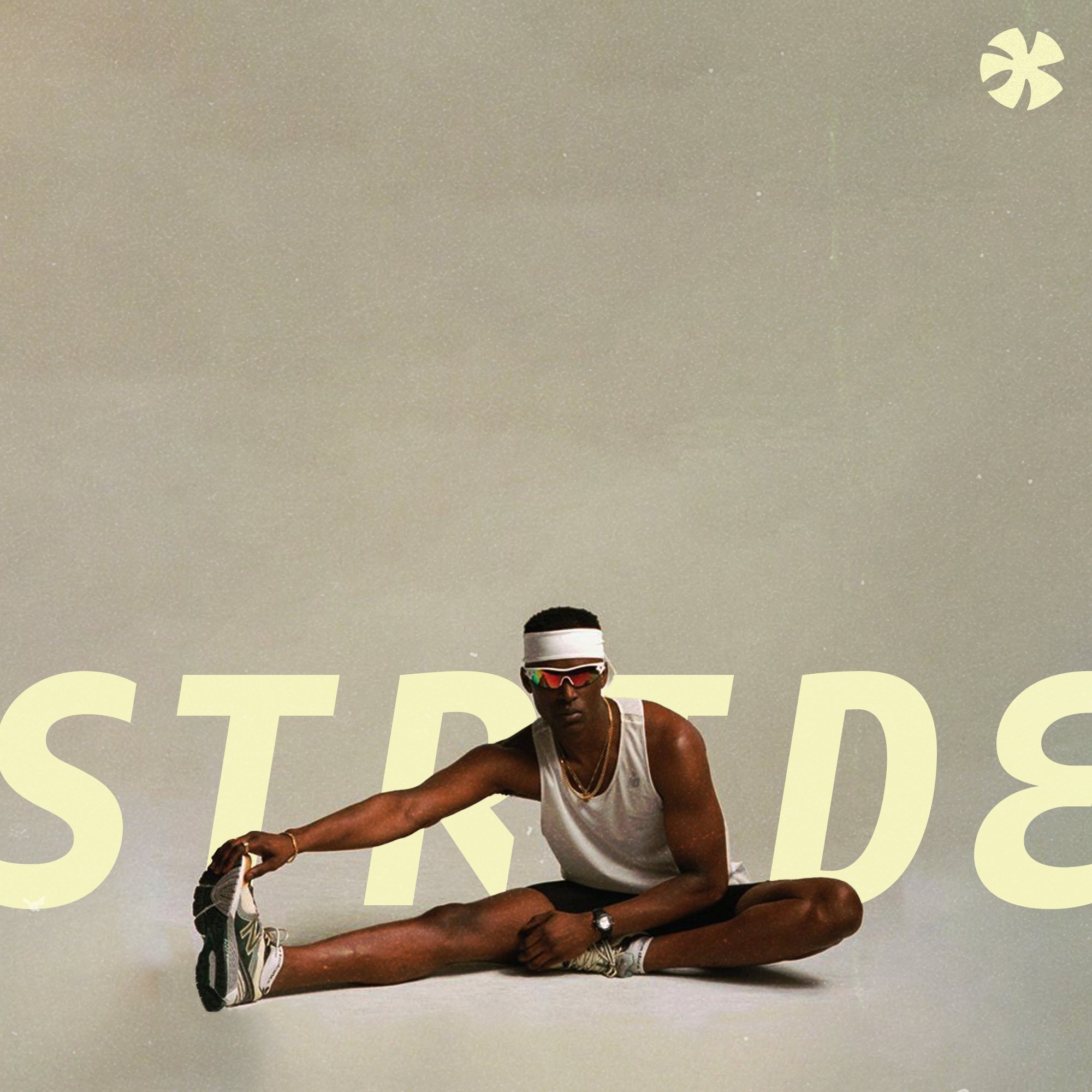
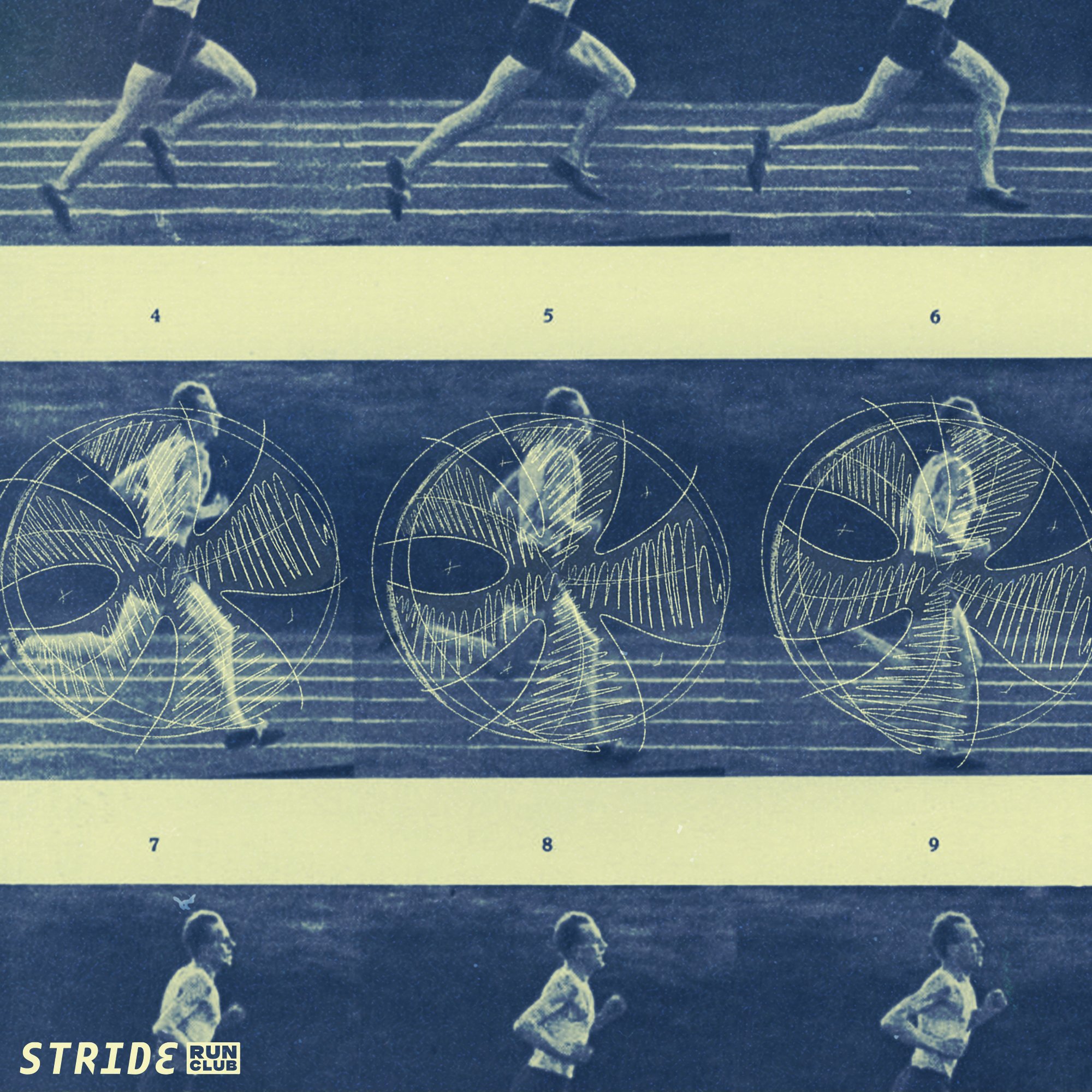
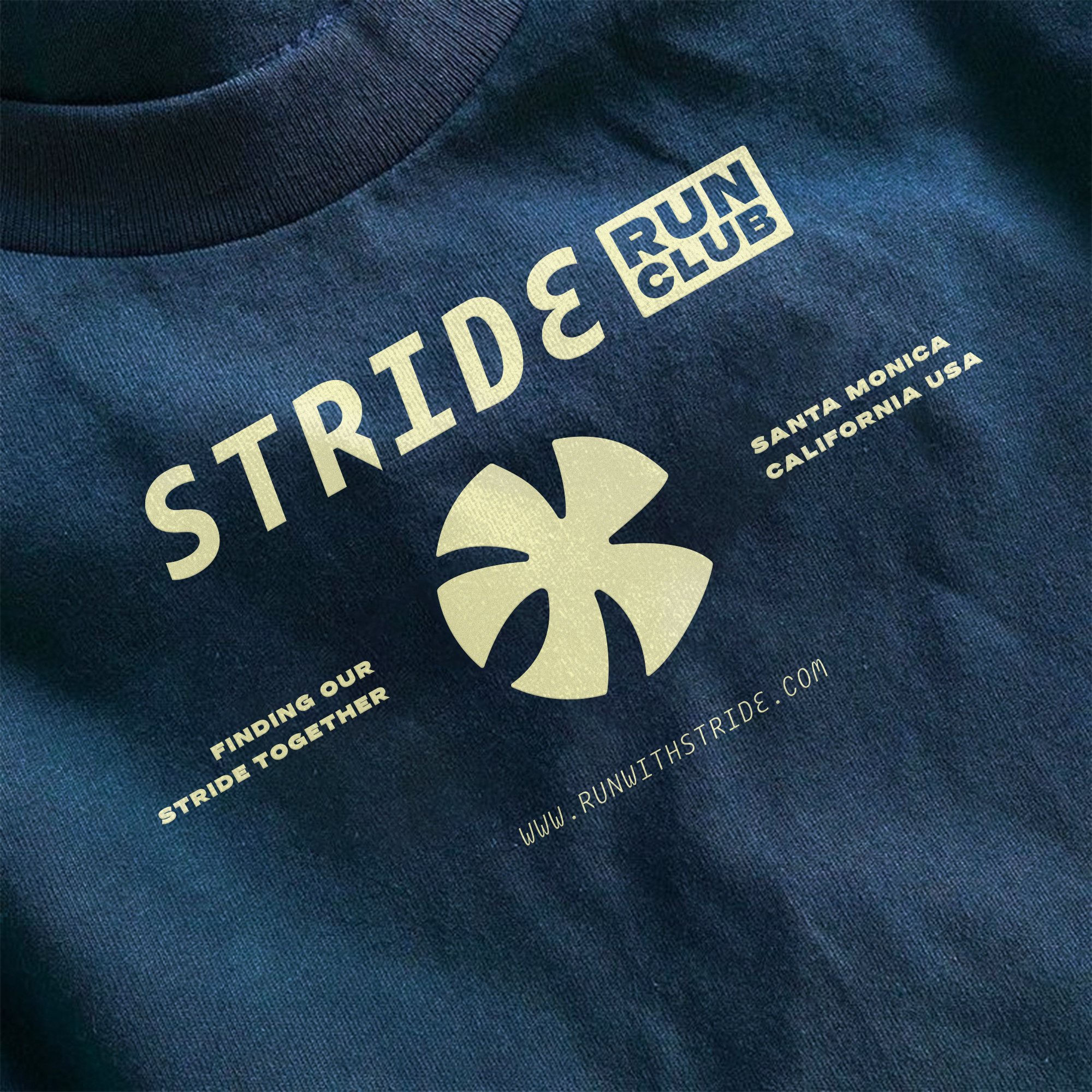
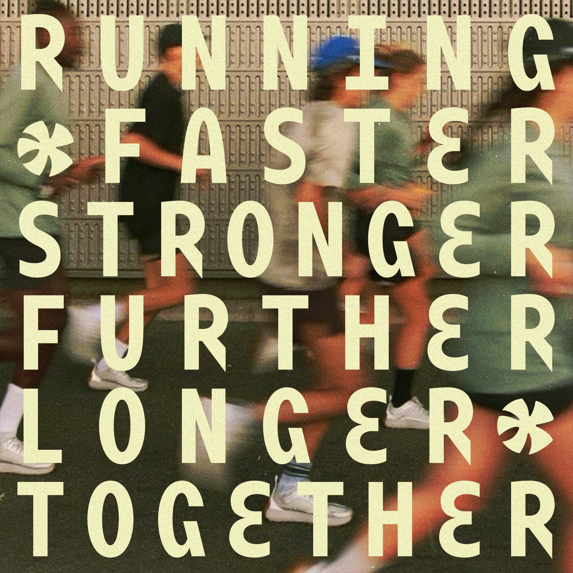
STRIDE RUN CLUB
BRIEF: STRIDE is an inclusive and energetic run club in Santa Monica, CA. Running off of sunshine and good vibes, the club promotes inclusivity for runners of all calibres. They wanted a logo mark that was dynamic and energetic. Something that felt like the atmosphere they were trying to create within their runs.
TARGET AUDIENCE: Individuals 20-35 years old who are interested in running but in a more social way. Typically singles, and people who practice an active and healthy(ish) lifestyle. Local to Santa Monia and surrounding areas.
SOLUTION: The mark is inspired by Santa Monica’s Sunshine and the cyclical nature of running. The top ray is the runner’s head, and as you work clockwise, the other rays are the runner’s arm, both legs and finally, the other arm. The swooping form is meant to add to the dynamic nature of the logo, mimicking the runner’s fluidity. The accompanying work mark and typeface chosen further exhibit these qualities in a youthful and interesting way.
TAGLINE(S): “Let’s find our stride together.” “ Run with Stride. “


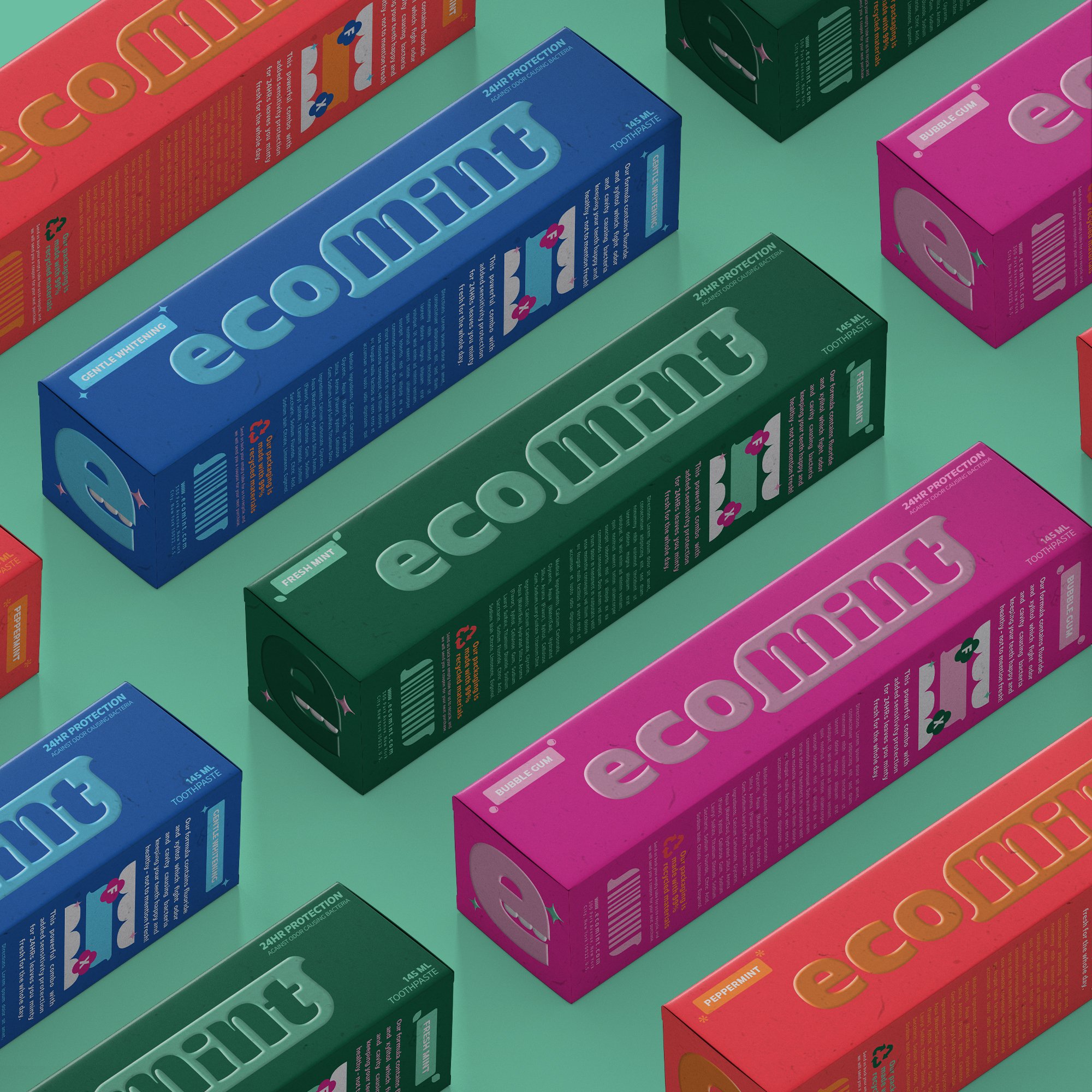
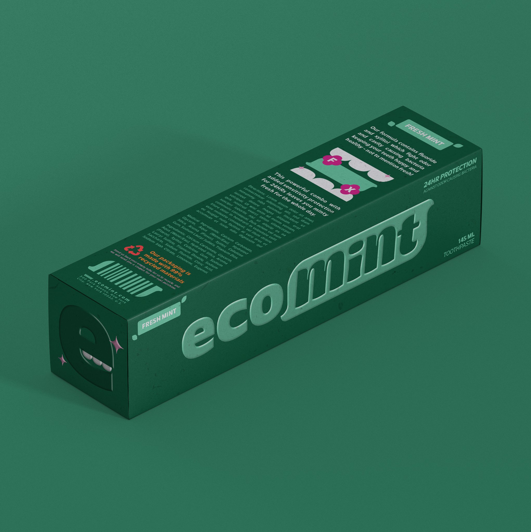
ECOMINT
BRIEF: Ecomint is a brand focused on bringing eco-concious oral care to the consumer. They want to stand out in an isle of bright-white squeeze tubes and eco-washed carboard with generic promises. They believe that we should be as picky with our toothpaste as we are with our food, and that brushing your teeth should be something you can smile about.
TARGET AUDIENCE: Individuals 16-45 years old who are conscious of their environmental footprint but not willing to sacrifice the performance of their purchase. They care about their smile and maintaining good oral hygiene, recognizing the impact it can have not only on their health but also on their social lives.
SOLUTION: I decided not to lean into the eco-friendly packaging that too often features shades of brown to remind the consumer of the trees they’re saving with their purchase. Instead, I wanted to highlight the product's benefits. So long for ingredients with promises they can't keep, our comment packaging is transparent about what ingredients are in the product and what they do. You don’t need to go to dental school to understand how good you're doing for your teeth.
TAGLINE(S): “Oral care to smile about.” “ This toothpaste was ‘mint’ for me. “


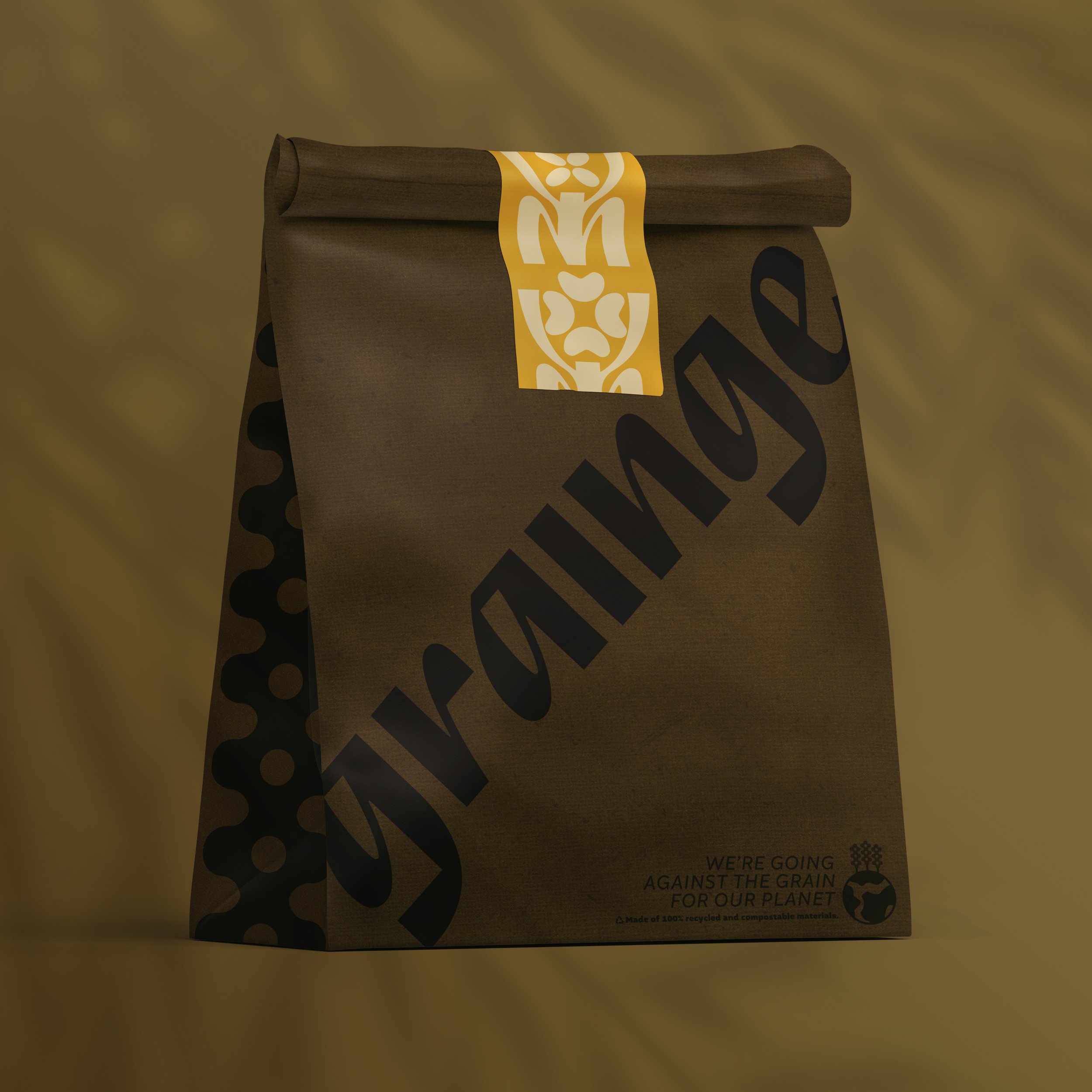
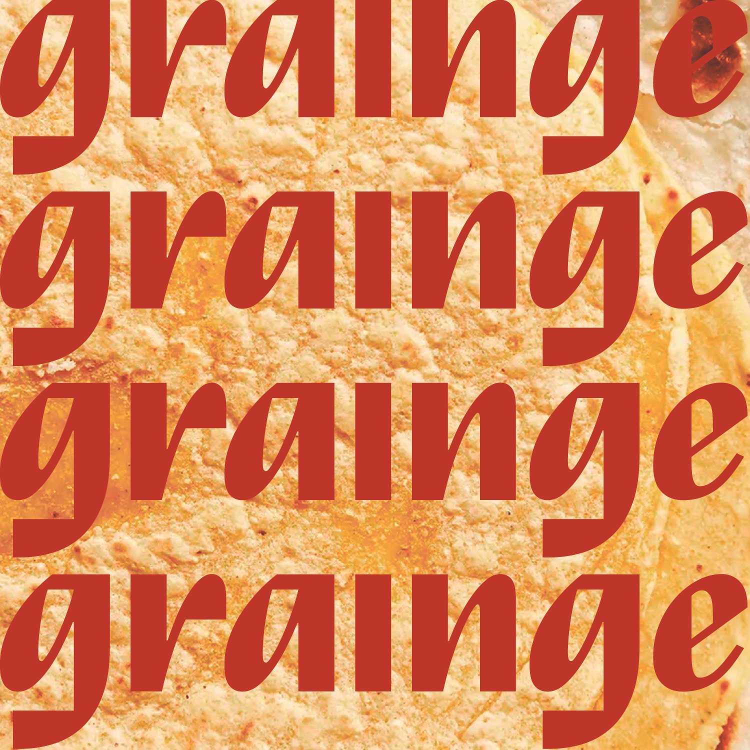
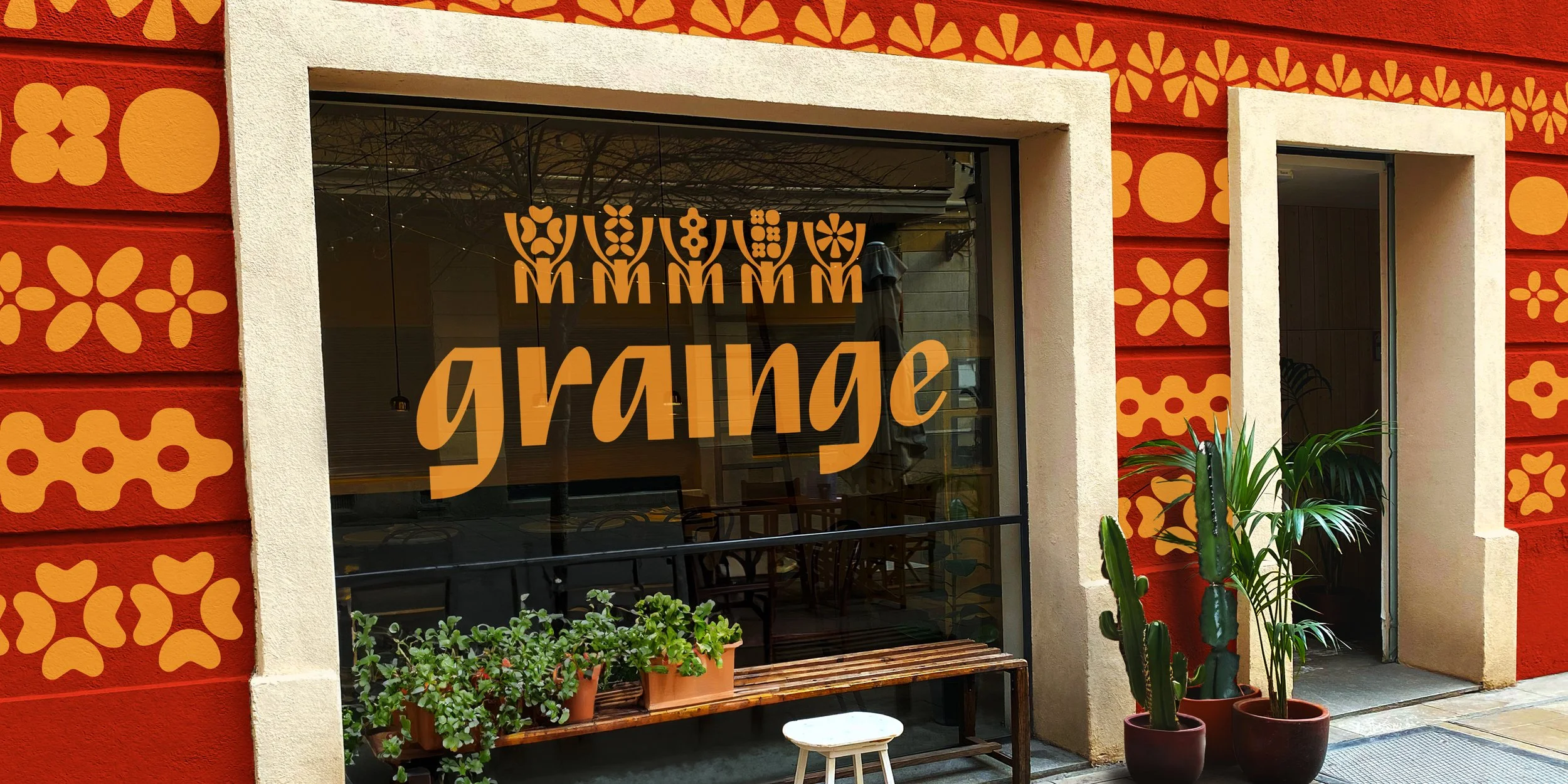
grainge
BRIEF: Grainge is a grain-based fast-casual restaurant with Oaxacan flavours that have been passed down fro generations. They adopted a vegan focus through hard times and stick by it to promote environmentally conscious farming practices. They wanted their branding to tie into their culture and have a modern feel.
TARGET AUDIENCE: Individuals 20-50+ years old who currently practice a vegan diet or rely on grain-based whole foods for their health needs. This consumer is conscious of supporting small businesses and appreciates other cultures and their cuisines and would probably identify as a bit of a “foodie” but without the cooking skills and know how necessary to translate their favourite dishes into vegan versions.
SOLUTION: This project drew its colour palette straight from the plate. I wanted the branding to match with the bold flavours that Grainge was cooking up. Each of the five family members is personified in the logo marks, which are abstract versions of grains used in their cooking—corn, quinoa, rice, etc. I wanted the characters to tie in seamlessly with the typeface I chose, so I used elements of the characters to create their bodies. The edgy font paired with the charming characters brings together the modern yet traditional vibe they sought.
TAGLINE(S): “Vegan Values Oaxacan Flavours” “ Going against the grain for the Planet. “