
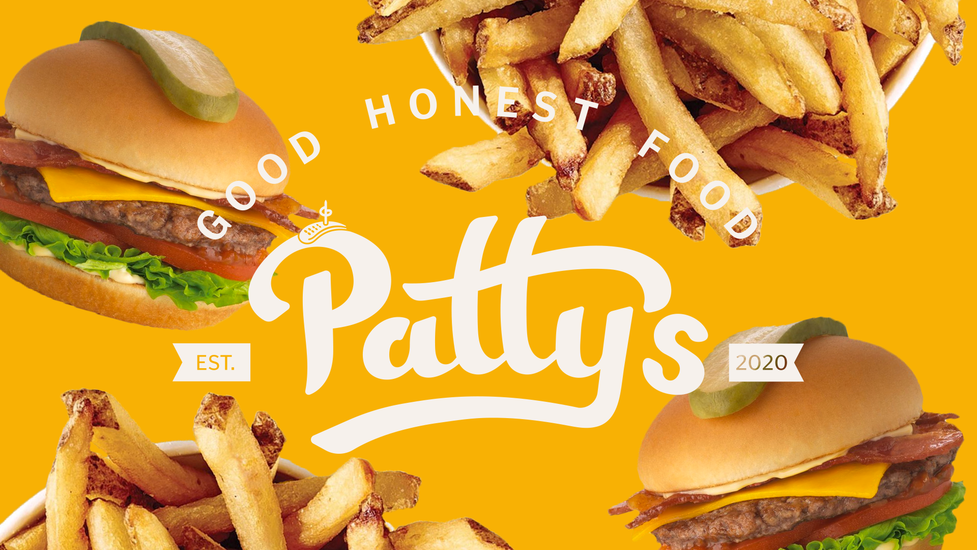
PATTY’S
Patty's is a collaborative blue-sky branding project that references old-school American motifs relating to baseball and personifies nostalgic diners of the past with the play on words with the name "Patty's." This nod to classic burger joints that focus on quality ingredients and family-like relationships with their customers was created in collaboration with restauranteur Sam Smith. His focus on eco-conscious practices and customer experience heavily influenced the initial concepts and the final design deliverables.
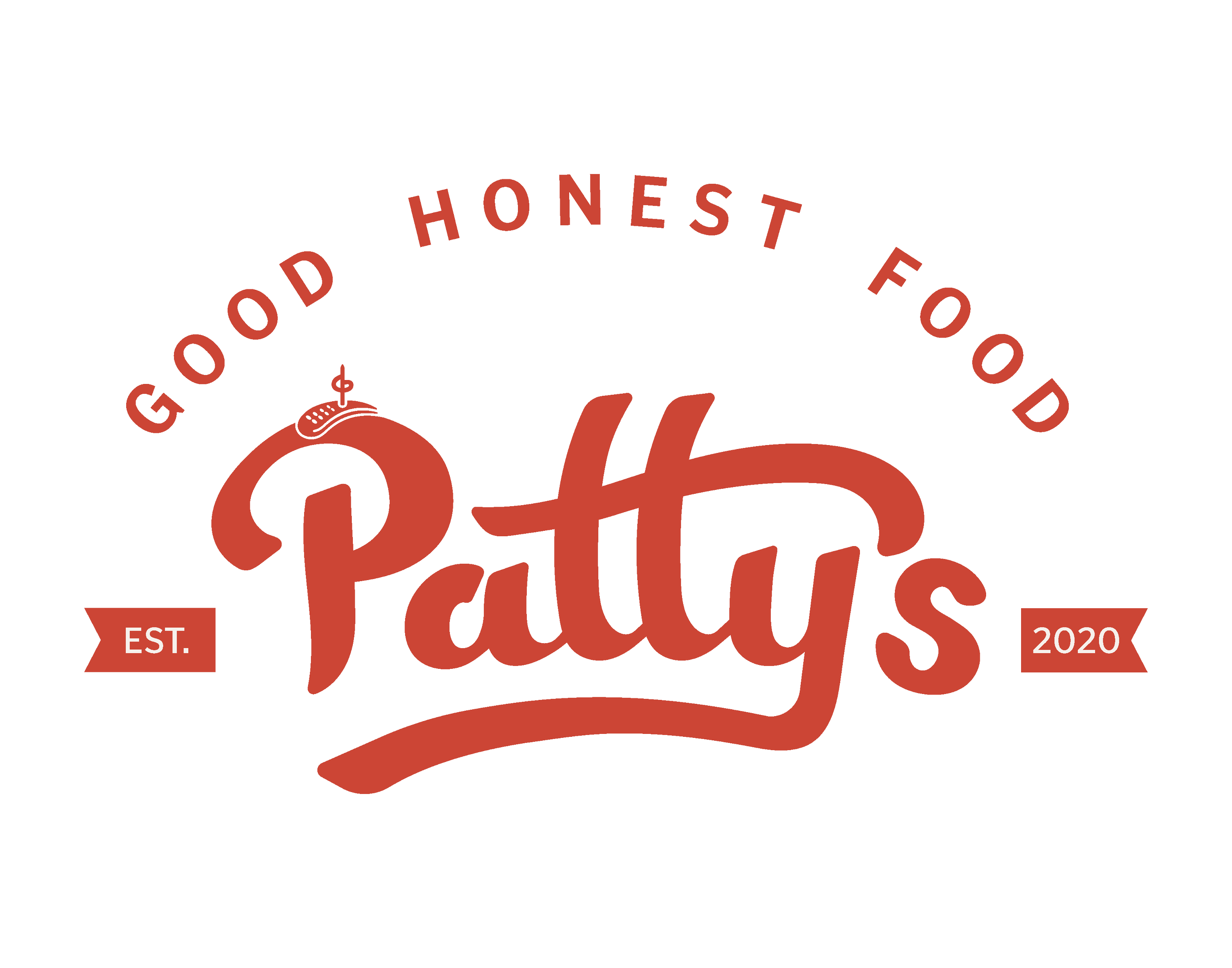
Primary Logo
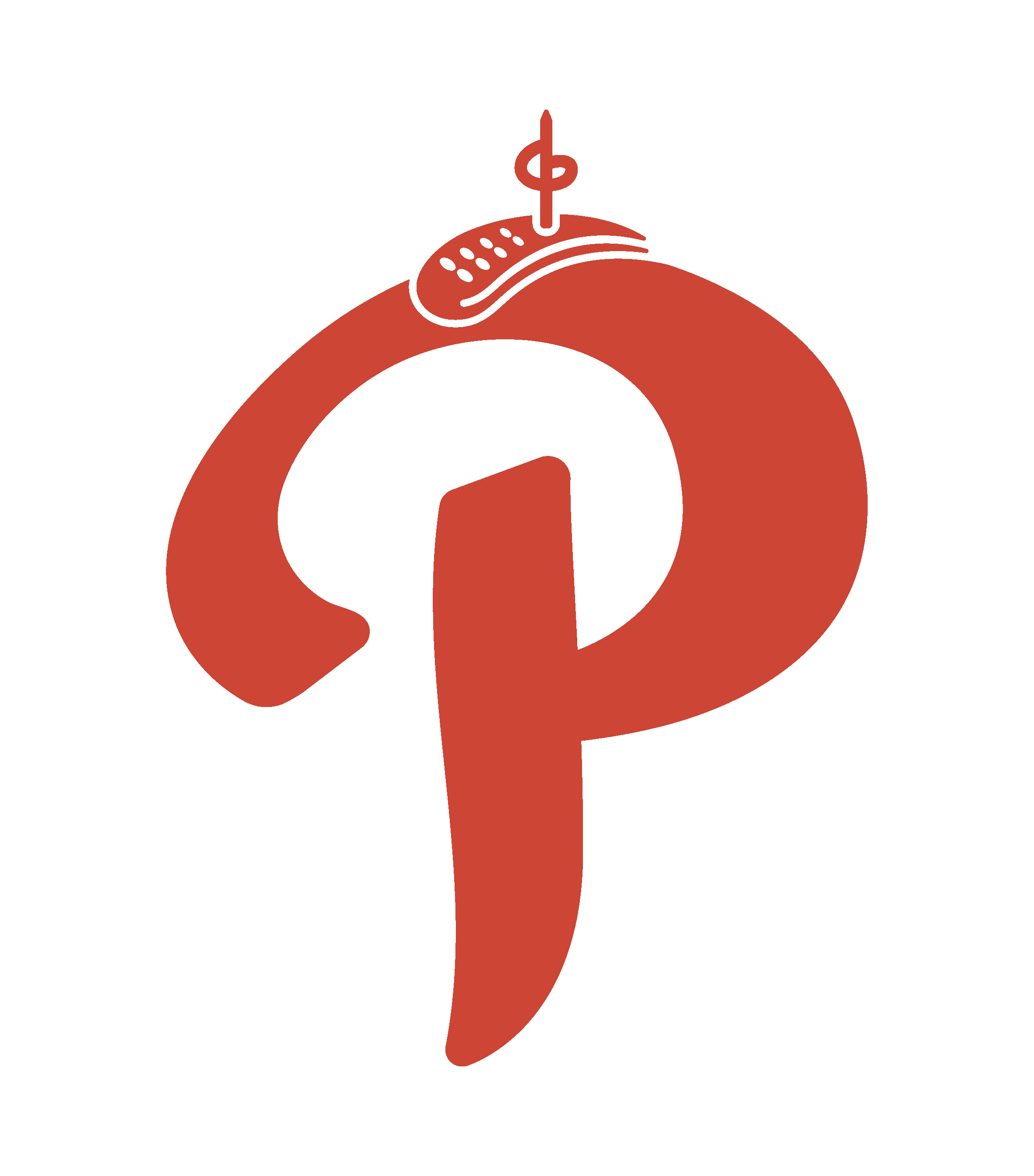
Secondary Logo
The name Patty’s is meant to reference a burger patty but also give the brand a persona. At Patty’s, you feel at home. It is a place where you go to socialize, relax, and get a solid burger. Patty is welcoming and kind, they care about their customers and would never serve you a burger they don’t think is good - excellent even. You are more than a customer to Patty, you’re a friend. Patty isn’t fussy, they care where it matters - for example, their ingredients - but won’t try and overcomplicate things. They focus on Good, Honest, Food.
The logo conveys this persona through its friendly hand-lettered font with smooth curves and inviting flow. The pickle on top of the “P” demonstrates Patty’s attention to its ingredients. For some, a pickle is nothing to write home about, but to others, pickles make or break a good burger. The pickle helps visualize that we care all the way down to the pickle at Patty's.
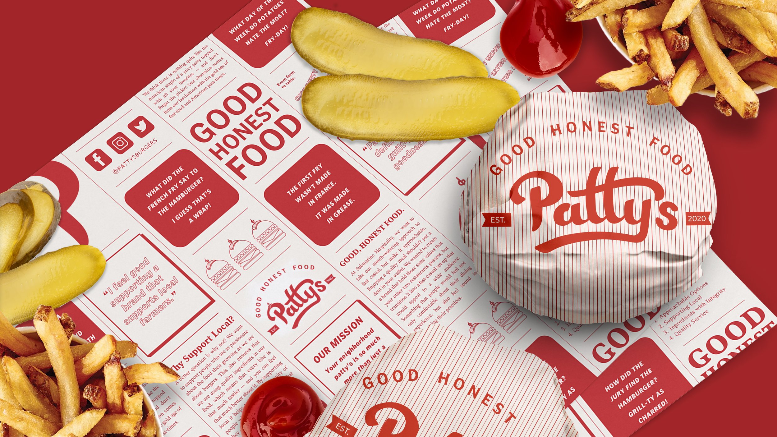
The burger wrap
Since customer experience was one of Sam Smith’s main priorities, his feedback heavily influenced the final design of the food packaging. Initially, the burger wraps were reversed, with the pinstriping on the inside and the outside being the custom pattern. After considering the user experience of a burger wrap, we decided to place the pattern on the inside so that the customer could read the jokes, reviews, and Patty’s story.
The MENU
Since Patty’s was created during the start of the pandemic in 2020, we chose to go with a reusable menu that allows for sanitization. This was also an eco-conscious way to reduce waste associated with constantly printing paper menus that sauces and soft drinks would inevitably ruin.

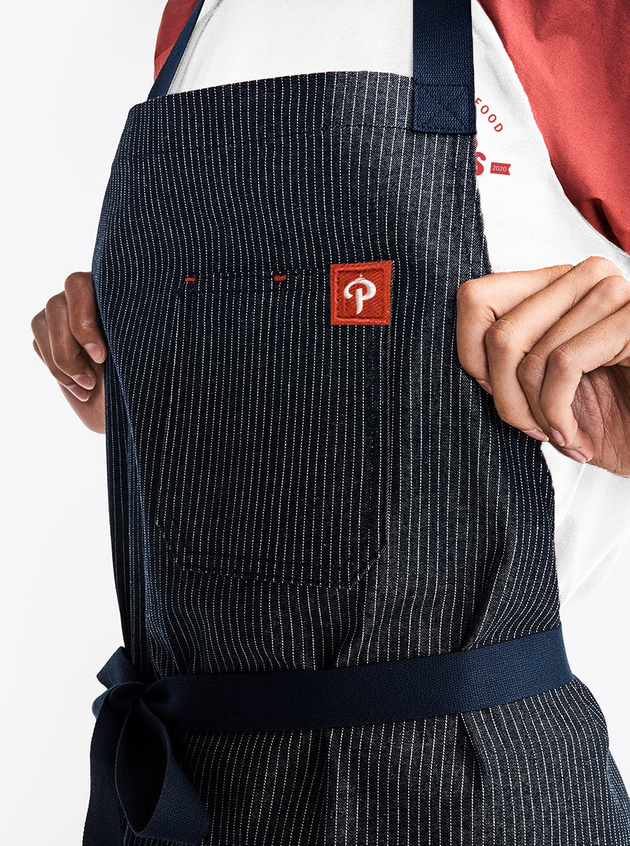
The UNIFORM
To keep with the nostalgic Americana theme, I chose Hedley and Bennett brand aprons with a pinstripe pattern. These specific aprons were chosen for multiple factors. This first being their materials and pattern, the pinstriping was a nod to old-school baseball uniforms, while the denim - an American staple - was chosen due to its durability. Secondly, it was the cut of the aprons. We wanted an apron with a tie low on the back and a halter-style strap around the neck not to obscure the design on the back of the uniform shirt.
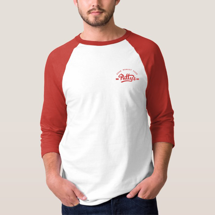


The employee shirts above were designed with both the employee and the customer in mind. As a nod to America’s past-time baseball, a raglan-style shirt was chosen. Since the employees would be wearing the above apron while making the customers’ orders, the design on the front of the shirt was purposely kept relatively minimal.
The design on the back of the shirt is meant to be personalized to the employee with their favourite Patty’s burger and toppings. Utilizing the back of the shirt was a conscious choice. Since the staff preparing orders behind the counter would be facing away from the customers, the design serves as an aide for indecisive customers like myself.
Want to see more?
Click on one of the project names below.